Tutorial for yellow caps (QAF)
Requested by ![]() diet
diet
Made using Photoshop CS, not translatable (sue me)
![]() diet requested a tutorial on working with QAF caps, but this works for all caps that are saturated with yellow.
diet requested a tutorial on working with QAF caps, but this works for all caps that are saturated with yellow.
 –>
–> 
| 01. |
Our base. Randypants aka Justin is ohsopretty, but the cap is an ugly yellow.
Tip for preparing your base: Don’t crop ist, resize it (Image –> Image size), paste it in a new 100×100 file and move it until you like it. I ususally choose a height between 110 and 180, depending on which part of the cap I want in the actual icon. Advantages of resizing are (often) better quality and the freedom to change the placement of your cap until the icon is finished. Don’t Sharpen! |
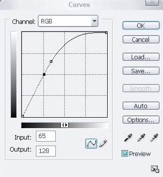
02.  |
It’s also way too dark. To brighten it: New Adjustment Layer > Curves RGB: Point One I:87 O:167 Point Two I:65 O:128 If it’s still too dark, duplicate your base and set it to screen on top of the Curves layer. Lower the opacity if it’s too bright. |
03.  |
With saturated pictures I like to lower the saturation. Because I don’t want glowy people in my icons, and because it makes the actual coloring process easier. QAF caps are quite dull, so we’ll have to up the contrast later. Combined with heavy saturation this quickly gives weird results.
Layer > New Adjustment Layer > Hue/Saturation |
04.  |
To get rid of the yellow, counterbalance with the complementary color purple. Go to Image < Adjustments < Variations.
On the Fine to Coarse scale, set the arrow one point down, to the left of the middle. Click once on magenta, once on cyan. It should look like this |
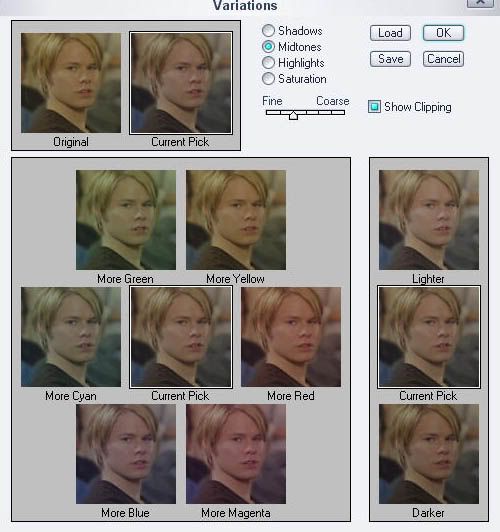
05.  |
It’s looking washed out, increasing the contrast will help with that.
New Adjustment Layer > Brightness/Contrast. Set the Contrast to +14. |
06.  |
Now for the basic coloring.
To get a more natural skin color and blonde, not yellow hair, we have to reduce the Yellows and increase the Reds. To make the skin more rosy, you have to up the red by reducing the darkening cyan in the Reds and increasing the yellow a bit. This is necessary, because skin always has a yellow hue in it. If you lower the yellow, the skin will get piggy pink. Here I have the following settings: REDS YELLOWS NEUTRALS Put this layer between the Curves and Contrast layer. |
07.  |
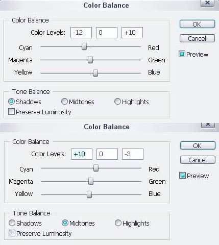
I still want a bit more overall blue, though more in the shadows, while the skin stays a fleshy color. For this go to Layer > New Adjustment Layer > Color Balance. This allows you to play with shadows. Basically it’s very easy and self-explanantory, you have to balance = experiment what works with your cap. To make the shadows blue, make sure you have “Shadows” selected and increase the cyan and blue. Important: It says balance, this means, don’t change just a color only in Shadows, it’ll change the color but leave it flat. ALWAYS add a bit of the counter color in the Midtones, and your color will come alive. Of course vice versa if you change the Midtones first. Here we increase cyan and blue in the Shadows, so we’ll increase red and magenta in the Midtones. NEVER mess with highlights. It might be popular, but it can mess up everything. My settings for this icon are here Put this layer between the Curves and Selective Color layer. If you like the result, you can stop here. |
| 08. |
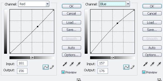
For more contrast and enhanced colors you can add an additional Curves layer. Go to Layer > New Adjustment Layer > Curves.
Add a tiny bit of blue by dragging the point in blue upwards, and take away a bit of red by lowering the point in Red. It should look like this RED: BLUE: You’re done. Additionally I blurred the background a bit.. |
As usual, a lot of rambling from me.
I hope it’s useful, feel free to ask any questions.
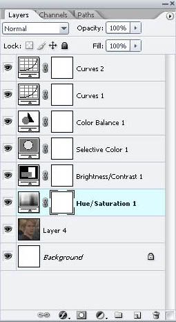
My layer palette: link
Comments are lovely, and so are questions. If you do end up using this I would love to see what you make out of it!
COMMENTS & QUESTIONS: HERE You can leave anonymous comments as long as you mentioned you are redirected from Reminiscent-Designs!
