This tutorial I wrote a while back and posted in my own graphics journal. Some of you might have seen it already.
Under the cut it’s a little wee bit of tutorial of one way I go about preparing a base for the icons I make. After I go through these few steps i add textures, text, brushes and what-not’s. This is one the quickest ways I think, and works very well for the more semi-dark qaf caps.
Hopefully someone might find it somewhat useful. I made it in PS CS2.
We’re going to go from:
this:
 (click for original size)
to this:

Welcome. School is in session…
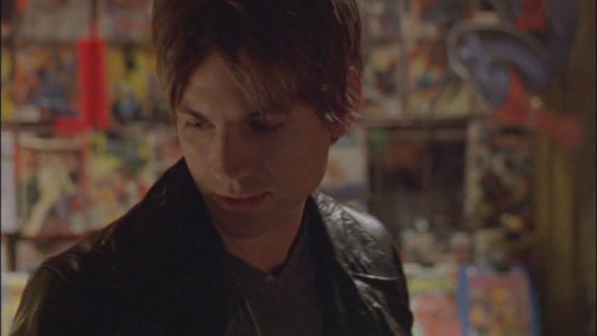
We’re going to start with this cap that

from when Brian comes to Mikey with the steak…but I digress… Let’s begin!
I crop it down to 100×100 using the crop tool and sharpen it once (Filter-Sharpen-Sharpen).

Choosing a good crop is – in my view – about 80% of the work. I usually try to find a good “dynamic” using the “one-third” theory. The focus of the shot should be in one third of the image. Top third, bottom third, left or right third… Did that make any sense? Anyway. This time I opted for having Brian in the left third of the icon and having him look outside the frame. I feel that this makes it more interesting…. I’m being very silly now, aren’t I? IT’S A FRIKKIN ICON!! GET ON WITH IT!!
Ehem.. ok…
The image is a bit dark – as usual with caps from QaF – so I want to light it up.
Layer – New Adjustment Layer – Levels
thank you
I drag the little gray arrow towards the center and the input levels read 0 1,59 255 when I’m happy with it. Now it looks like this:

Now the problem is that it’s a bit “whishy-washy”. It needs contrast.
Layer – New Adjustment Layer – Brightness/Contrast
Again I play with the levels and when I’m happy, Brightness is set at +21 and Contrast at +48.
Result:

Now I would like to work on the whole icon. Normally you see tutorials suggesting that you should flatten the image. I almost never do that until I’m completely finished to give me more control and ability to go back if I mess up along the way. So instead I use a “hot-key” (or a shortcut) that will give me a merged copy in a new layer. Like this: Shift+Ctrl+Alt+E – or as I call it: The Four Finger Push…
I sharpen this once again Filter-Sharpen-Sharpen and then fade it to 60% (Edit-Fade Sharpen).
Looks like this:

The icon is now a bit gritty so I use the blur tool with a soft round brush, size 5px, and the strength set to 21%, and blur his skin and clothes. Be careful when you do this and don’t go over the edges, since it will ruin the sharpening you just did. I Also usually blur the background a bit so that the focus of the icon – this time, Brian – will “pop” a bit more. This time I used a bit bigger brush and set the strength to 31%. tip: use the Navigator to enlarge the icon so you don’t need to squint so much!
Violá:

Almost done. I don’t like the overly sharp colors though. So I, once again, use an adjustment layer:
Layer – New Adjustment Layer – Hue/Saturation
I drop the Saturation to -17.
Finished!
Hope I didn’t bore you to death!
That’s it. Schools out!
As for any sort of tutorial – the exact values I’m using might not work for other images. So “experiment” is the catch phrase of the day!
Good Luck!
COMMENTS & QUESTIONS: HERE You can leave anonymous comments as long as you mentioned you are redirected from Reminiscent-Designs!
